- How to load data?
1. Import display, %matplotlib inline, datasets and numpy packages
from IPython.display import Image
%matplotlib inline
from sklearn import datasets
import numpy as np
2. Load predefined data set by writing datasets.load_datasetname(). Store result in a variable
iris = datasets.load_iris()
2. How to identify data features and target?
- Column 2 and 3 are the data features. Write variable.data and select all its rows and just the 2nd and 3rd column
iris.data[:, [2, 3]] - Store result in a variable
X = iris.data[:, [2, 3]]
3. Write variable.target. This selects all the entire column by default
iris.target
4. Store result in a variable
y = iris.target
3. How to identify training and testing data?
- Import train_test_split and cross_val_score
from sklearn.cross_validation import train_test_split, cross_val_score2. Write train_test_split function
train_test_split()
3. Use data features, target as argument
train_test_split(X, y)
4. Optionally, add to other arguments like test_size and random_state
train_test_split(X, y, test_size=0.33, random_state=42)
5. Store function in variables that represent training data features, testing data features, training target and testing target (in that order)
X_train, X_test, y_train, y_test = train_test_split(X, y, test_size=0.33, random_state=42)
4. How to scale my data?
- Import the following
from sklearn.preprocessing import StandardScaler
2. Write StandardScaler function and store it in a variable
sc = StandardScaler()
3. Fit scaler (variable) in terms of the training data to create a model; thus, use the training data features as argument
sc.fit(X_train)
4. Find the standard deviation of the training and testing data features by using each of them as arguments of two variable.transform()
sc.transform(X_train)
sc.transform(X_test)
5. Store both results in variables
X_train_std = sc.transform(X_train)
X_test_std = sc.transform(X_test)
5. What are the functions behind Support Vector Machine?
- Import the following
from matplotlib.colors import ListedColormap
import matplotlib.pyplot as plt
import warnings- Split decimals function
- Create a function that takes a string argument
def versiontuple(v):
- Inside the function, split argument wherever it has a dot
def versiontuple(v):
v.split(".")- Inside the function, turns the resulting strings as integers
def versiontuple(v):
map(int, (v.split(".")))- Return the integers inside a tuple
def versiontuple(v):
    return tuple(map(int, (v.split("."))))
2. Plot decision regions and data function
- Create a function that takes data features, target and classifier as arguments. Also set test_idx parameter is set to None (so that there is no training data for now) and resolution parameter to 0.02 (so that we have a relatively small step)
def plot_decision_regions(X, y, classifier, test_idx=None, resolution=0.02):
- Create two tuples that will represent our marker generator and color map. The first one will be a set of letters and the second one will be a set string colors.
    ('s', 'x', 'o', '^', 'v')
('red', 'blue', 'lightgreen', 'gray', 'cyan')- Store results tuples in two separate variables
    markers = ('s', 'x', 'o', '^', 'v')
colors = ('red', 'blue', 'lightgreen', 'gray', 'cyan')- Write ListedColormap function to get the code that symbolizes a certain color
ListedColormap()
- As an argument, take all colors from index 0 to the amount of target classes
ListedColormap(colors[:len(np.unique(y))])
- Store result in a variable
cmap = ListedColormap(colors[:len(np.unique(y))])
- Define the range maximum and minimum for the first column. For doing so, find its maximum row value plus 1 and its minimum row value minus 1. Remember two put a comma between maximum and minimum
X[:, 0].min() - 1, X[:, 0].max() + 1
- Store result in two new variables
X[:, 1].min() - 1, X[:, 1].max() + 1
- Do the same for the following column and print results
    x1_min, x1_max = X[:, 0].min() - 1, X[:, 0].max() + 1
    x2_min, x2_max = X[:, 1].min() - 1, X[:, 1].max() + 1
    print x1_min, x1_max
    print x2_min, x2_max

- Turn each line into array of numbers from x_min to x_max whose numbers differ by a small step (resolution) and see output
    np.arange(x1_min, x1_max, resolution),
    np.arange(x2_min, x2_max, resolution)

- Make a grid (array of list of lists) by using the arrays above as arguments of np.meshgrid()
     np.meshgrid(np.arange(x1_min, x1_max, resolution),
np.arange(x2_min, x2_max, resolution))- Store result in two variables and see output
     xx1, xx2 = np.meshgrid(np.arange(x1_min, x1_max, resolution),
     np.arange(x2_min, x2_max, resolution))
     xx1, xx2
- Flatten each grid (so that all its lists become a single list inside a list) using .ravel and make an array with the results
np.array([xx1.ravel(), xx2.ravel()])
![]()
- Transpose array, so that number of columns become number of rows and viceversa

- Predict outcome using previous array using classifier. Classifier is a general argument we give to the function, but we will later input a Logistic Regression model in its place
![]()
- Reshape the array so that it has the same amount of lists as the grid. See output
     Z = Z.reshape(xx1.shape)
     Z
- Create a color map of the two grid arrays (that represent map’s X and Y axis) and reshaped Z (that represents map’s Z axis). To do this write plt.contourf and use the two grid arrays and reshaped Z as arguments
plt.contourf(xx1, xx2, Z, alpha=0.4, cmap=cmap)
- Set alpha (transparecy) parameter to some value and cmap (type of color map) parameter to cmap. See output
plt.contourf(xx1, xx2, Z, alpha=0.4, cmap=cmap)

- Just in case you want to be extra sure that you are setting your axis to desired boundaries, write the following
    plt.xlim(xx1.min(), xx1.max())
plt.ylim(xx2.min(), xx2.max())- Loop through all the target types
for cl in np.unique(y):
- Assign a number for each type as you loop
for idx, cl in enumerate(np.unique(y)):
- Inside loop, create a Scatter Plot
plt.scatter()
- Index all data features for which a target is a type of color and belongs to column 0
X[y == cl, 0]
- Set previous result to x paramer of ScatterPlot
plt.scatter(x=X[y == cl, 0])
- Do the same for column 1, but set its result o y parameter of ScatterPlot
plt.scatter(x=X[y == cl, 0], y=X[y == cl, 1])
- Set c paramater to cmap(number of types of data features), so that we get three different colors for our data
plt.scatter(x=X[y == cl, 0], y=X[y == cl, 1], c=cmap(idx))
- Optionally, to alter color set alpha (transparency) parameter to 0.8, marker to markers[number of types of data features] and label to type of data features
        plt.scatter(x=X[y == cl, 0], y=X[y == cl, 1],
        alpha=0.8, c=cmap(idx),
        marker=markers[idx], label=cl)
- Write numpy version we are using
np.__version__
- Split previous value with split decimals function (step 1)
versiontuple(np.__version__)
![]()
- Do the same for string ‘1.9.0
versiontuple('1.9,0')
- Compare both versions in the following way to see if our current version is greater than 1.9
if not versiontuple(np.__version__) >= versiontuple('1.9.0')
- If it is greater, index a certain amount of numbers from the X and Y arrays. These would be our testing data features and target. Notice we call test_idx to the 1st to nth number we are going to choose from the data features and target, because we will input them in the function we are
X_test, y_test = X[test_idx], y[test_idx]
- Else, give a warning and index still
        else:
X_test, y_test = X[test_idx], y[test_idx]- See output with sample data features, target, logistic Regression classifier and test that take 105th to 149th values of the data features and targets each
plot_decision_regions(X, y,
classifier=lr, test_idx=range(105, 150))
- Notice that if we input the scaled standard deviation of the data features, instead of the data featurest, we plot this

3. Sigmoid function
- Import pyplot and numpy
import matplotlib.pyplot as plt
import numpy as np- Create a function that takes an argument
def sigmoid(z):
- Return a function that calculates 1.0 over 1.0 plus the e^-x’s of the n array of numbers
def sigmoid(z):
return 1.0 / (1.0 + np.exp(-z))- Create the array of numbers and store it in variable
z = np.arange(-7, 7, 0.1)
- Write function in terms of previous variable. Store function in new variable
phi_z = sigmoid(z)
- Plot array of numbers vs function. You may need to add plt.show() at the end of every update
plt.plot(z, phi_z)

- Plot x=0 (vertical middle line)
plt.axvline(0.0, color=’k’)

- Define visual limit below y=0 and above y=1 for better visualization
plt.ylim(-0.1, 1.1)

- Label x axis as z and y axis as phi(z)
plt.xlabel(‘z’)
plt.ylabel(‘$\phi (z)$’)

- If you just want to see relevant numbers in the y-axis, choose the ticks

plt.yticks([0.0, 0.5, 1.0])

- If you want dotted horizontal lines passing by your ticks, write the following
ax = plt.gca()
ax.yaxis.grid(True)
- If we want to make the graph bigger and more visually proportional, write this
plt.tight_layout()

- To save your picture, write the path where you want to save it, / and picture_name.png. You can set dpi (pixels) parameter to 300
plt.savefig('/Users/omaraguilar/DSI_SM_01/curriculum/week-05/sigmoid.png', dpi=300)
4. Cost 0 and 1 function. Is this variance and bias tradeoff? (fix!)
- Create a function that takes an argument
def cost_1(z):
- Return the negative logarithm of the sigmoid function (Step 2)
return - np.log(sigmoid(z))
- Create another function that takes an argument
def cost_0(z):
- Retun the negative logarithm of 1 minus the sigmoid function
return - np.log(1 - sigmoid(z))
4. Join sigmoid, cost_0 and cost_1 functions
- Define z as an array whith numbers from – 10 to 10 that differ by 0.1
z = np.arange(-10, 10, 0.1)
- Store sigmoid function in a variable
phi_z = sigmoid(z)
- Loop through mentioned array, and append the values of cost_1(x) into a list
c1 = [cost_1(x) for x in z]
- Plot the values of sigmoid function v.s. previous list values
plt.plot(phi_z, c1)
- Set label parameter to ‘J(w) if y=1’
plt.plot(phi_z, c1, label='J(w) if y=1')
- Loop through mentioned array, and append the values of cost_0(x) into a list
c0 = [cost_0(x) for x in z]
- Plot the values of sigmoid function v.s. previous list values. You may need to write plt.show() at the end of each update
plt.plot(phi_z, c0)
- Set label parameter to ‘J(w) if y=0’
plt.plot(phi_z, c0, label='J(w) if y=0')
- Define vertical visual limit below y=0 and above y=1 for better visualization
plt.ylim(0.0, 5.1)
- Define horizontal visual limit below x=0 and above y=1 for better visualization
plt.xlim([0, 1])
- Label x axis as phi(z) and y axis as J(w)
plt.xlabel('$\phi$(z)')
plt.ylabel('J(w)')- To create a legent write the following
plt.legend(loc='best')
- If we want to make the graph bigger and more visually proportional, write this
plt.tight_layout()
- To save your picture, write the path where you want to save it, / and picture_name.png. You can set dpi (pixels) parameter to 300
plt.savefig('/Users/omaraguilar/DSI_SM_01/curriculum/week-05/log_cost.png', dpi=300)- See output

5. Improve Plot Decisions and data function
- Import Logistic Regression from scikit learn package
from sklearn.linear_model import LogisticRegression
- Use the training and testing scaled data features as arguments of np.vstack to create an array with an two vertically piled arrays inside
np.vstack((X_train_std, X_test_std))
- Store array in a variable
X_combined_std = np.vstack((X_train_std, X_test_std))
- Do the same for training and testing non-scaled target
y_combined = np.hstack((y_train, y_test))
- Set LogisticRegression’s regularization strength parameter (c) to a high value to get a small precise width
LogisticRegression(C=1000.0)
- Set LogisticRegression’s regularization random_state parameter to 0 , so that we can contol the model
LogisticRegression(C=1000.0, random_state=0)
- Store function in an indented variable for better manipulation
lr = LogisticRegression(C=1000.0, random_state=0)
- Fit function to scaled training data and training target to create a model
lr.fit(X_train_std, y_train)
- Use the two variables we defined at the beginning of step 5 as arguments of the plot decisions and data function
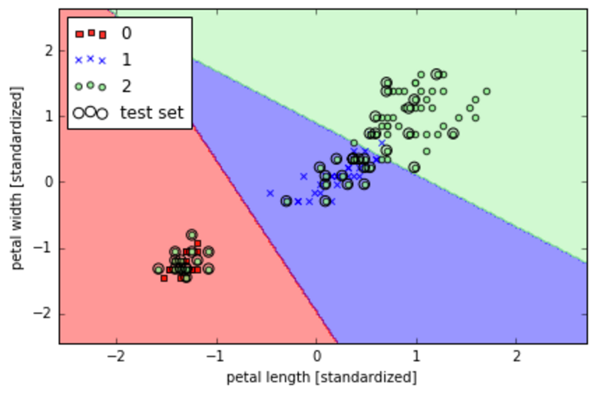
plot_decision_regions(X_combined_std, y_combined)
- Also set classifier parameter to the indented variable and test_idx parameter to the 1st to nth number we are going to choose from the data features and target from
plot_decision_regions(X_combined_std, y_combined,
classifier=lr, test_idx=range(105, 150))- Label x axis as scaled petal length and y axis as scaled petal width
plt.xlabel('petal length [standardized]')
plt.ylabel('petal width [standardized]')- To create a legend write the following
plt.legend(loc='upper left')
- If we want to make the graph bigger and more visually proportional, write this
plt.tight_layout()
- To save your picture, write the path where you want to save it, / and picture_name.png. You can set dpi (pixels) parameter to 300
plt.savefig('/Users/omaraguilar/DSI_SM_01/curriculum/week-05/log_cost.png', dpi=300)
- See output

